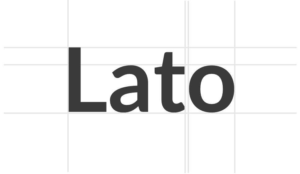
01Lato makes people have the choice
Discover & try some font weights
-
Light 300
abcdefgklmnopqrstuvwxyz0123456789$%£+=°¨&é«'(§è!çà*¨^`;?.,#@Ù∞…÷Ù€ô}¡¶{
-
Regular 400
abcdefgklmnopqrstuvwxyz0123456789$%£+=°¨&é«'(§è!çà*¨^`;?.,#@Ù∞…÷Ù€ô}¡¶{
-
Bold 700
abcdefgklmnopqrstuvwxyz0123456789$%£+=>&é«'(§è!çà*¨^`;?.,#@Ù∞…÷Ù€ô}¡¶{
Lato is available in 18 different font styles !
02Lato is all about design
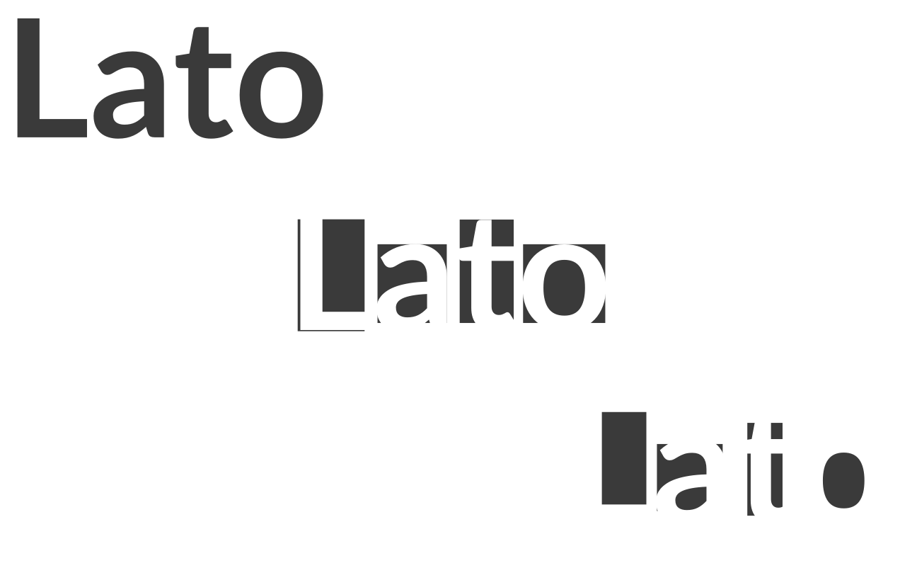
A font with harmony and elegance
The semi-rounded details of the letters give Lato a feeling of warmth, while the strong structure provides stability and seriousness.
 A typeface that seem quite "transparent"
Four years of type design and two days of “digital filmmaking” with FontLab Studio, Python, RoboFab, librsvg, Adobe AfterEffects and Digital Perfomer. This film illustrates the evolution of Lato.
03Lato looks beautiful with lots of items & is very easy to combine
See some Lato integrations
-
 T-shirt Bold & heavy uppercase
 -
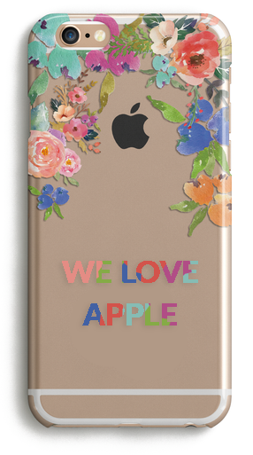 Apple case Bold uppercase
 -
 Poster for an event Heavy, bold, light
04Lato is known worldwide
More information about Lato
Lato is a sans serif typeface family. In December 2010 the Lato family was published under the Open Font License by his foundry tyPoland, with support from Google.
6.44B
Number of times Google Fonts API served Lato over the last week. Lato is featured in more than 6,373,997 websites.
05Lato is made by an awesome designer
Discover who drew this typeface

Łukasz is a Warsaw-based designer. During Poland's first free elections in 1989, he joined Gazeta Wyborcza, the first independent daily newspaper, and soon found a home in the design department co-creating page layouts and his first typeface.
In 2007, he created a three-style Latin and Cyrillic corporate family for empik, one of Poland’s largest retail networks. In 2010, he started the Lato project, to develop a high-quality open-source font family.
A bit more history...
In the last ten or so years, during which Łukasz has been designing type, most of his projects were rooted in a particular design task that he needed to solve. With Lato, it was no different.
Originally, the family was conceived as a set of corporate fonts for a large client — who in the end decided to go in different stylistic direction, so the family became available for a public release.
It's why...
When working on Lato, Łukasz tried to carefully balance some potentially conflicting priorities. He wanted to create a typeface that would seem quite “transparent” when used in body text but would display some original traits when used in larger sizes.
He used classical proportions (particularly visible in the uppercase) to give the letterforms familiar harmony and elegance. At the same time, he created a sleek sans serif look, which makes evident the fact that Lato was designed in 2010 — even though it does not follow any current trend.